In this article, we will learn how to create reusable Card and Button components in react. Below are the steps that we are going to follow,
- Create a form to add a user
- Create a Card component
- Use the Card component
- Create a Button component
- Use the Button component
Create a form to add user
- Create a react app and write down the below code snippet in the project directory (AddUser.js),
import React from 'react';

const AddUser = () => {
    const handleFormSubmission = e => {
        e.preventDefault();

    }
    return (
        <div>
            <form
                onSubmit={handleFormSubmission}
                className='border-2 border-gray-400 shadow-lg rounded-md w-1/2'>
                <div className='my-4 block mx-auto w-1/2'>
                    <label htmlFor="name"></label>
                    <input className='input input-bordered w-full max-w-xs' id='name' name="name" type="text" placeholder='name' />
                </div>
                <div className='my-4 block mx-auto w-1/2'>
                    <label htmlFor="email"></label>
                    <input className='input input-bordered w-full max-w-xs' id='email' name="email" type="email" placeholder='email' />
                </div>

                <div className=' my-10 block mx-auto w-1/2'>
                    <button className='btn' type="submit">Submit</button>
                </div>
            </form>
        </div>
    );
};

export default AddUser;
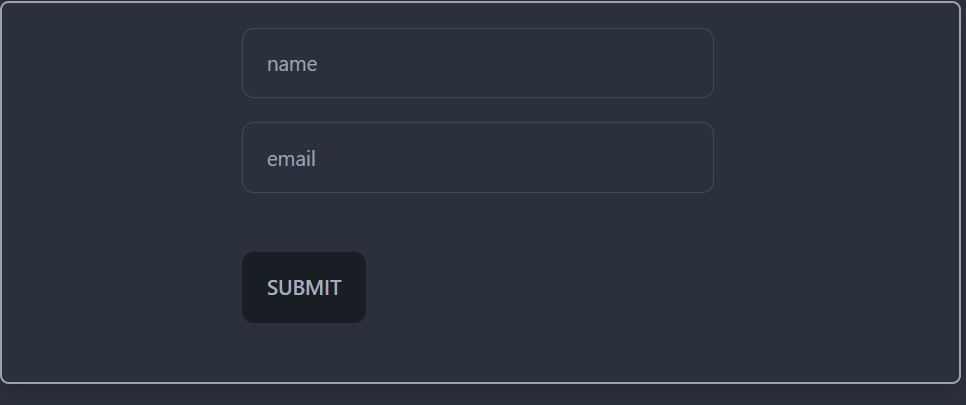
Note: please read this article to know more about creating a component to add user.
Create a Card component
- Create a component named, Card.js in the project directory.
import React from 'react';

const Card = () => {
    return (
        <div>

        </div>
    );
};

export default Card;
- Pass props as an argument of this function
import React from 'react';

const Card = (props) => {
    return (
        <div>

        </div>
    );
};

export default Card;
- Import this component in the AddUser component and wrap the form with this Card component.
import React from 'react';
import Card from './Card';

const AddUser = () => {
    const handleFormSubmission = e => {
        e.preventDefault();

    }
    return (
        <div>
            <Card>
                <form
                    onSubmit={handleFormSubmission}
                    className='border-2 border-gray-400 shadow-lg rounded-md w-1/2'>
                    <div className='my-4 block mx-auto w-1/2'>
                        <label htmlFor="name"></label>
                        <input className='input input-bordered w-full max-w-xs' id='name' name="name" type="text" placeholder='name' />
                    </div>
                    <div className='my-4 block mx-auto w-1/2'>
                        <label htmlFor="email"></label>
                        <input className='input input-bordered w-full max-w-xs' id='email' name="email" type="email" placeholder='email' />
                    </div>

                    <div className=' my-10 block mx-auto w-1/2'>
                        <button className='btn' type="submit">Submit</button>
                    </div>
                </form>
            </Card>
        </div>
    );
};

export default AddUser;
- Here, we have wrapped the whole form with this Card component,
- Go to the Card component and inside the return div receive this form as a children of the Card component.
import React from 'react';

const Card = (props) => {
    return (
        <div>
            {props.children ? props.children : undefined}
        </div>
    );
};

export default Card;
We will get the form elements as a child of this Card component as we have wrapped the form with this component. So basically that form tag and all the elements inside of that form tag is children of this component.
- Add className in the Card component return div and pass props.className as value of it
import React from 'react';

const Card = (props) => {
    return (
        <div className={props.className}>
            {props.children ? props.children : undefined}
        </div>
    );
};

export default Card;
This way, we will get any className that is passed down to this as props.
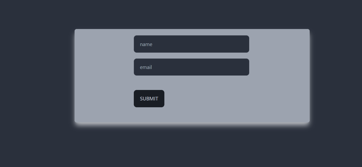
- Add some styled classNames in the Card component in the AddUser.js component
import React from 'react';
import Card from './Card';

const AddUser = () => {
    const handleFormSubmission = e => {
        e.preventDefault();

    }
    return (
        <div>
            <Card className="bg-gray-400 mx-auto my-24 rounded-md shadow-gray-300 shadow-lg w-1/2">
                <form
                    onSubmit={handleFormSubmission}
                    className='border-2 border-gray-400 shadow-lg rounded-md'>
                    <div className='my-4 block mx-auto w-1/2'>
                        <label htmlFor="name"></label>
                        <input className='input input-bordered w-full max-w-xs' id='name' name="name" type="text" placeholder='name' />
                    </div>
                    <div className='my-4 block mx-auto w-1/2'>
                        <label htmlFor="email"></label>
                        <input className='input input-bordered w-full max-w-xs' id='email' name="email" type="email" placeholder='email' />
                    </div>

                    <div className=' my-10 block mx-auto w-1/2'>
                        <button className='btn' type="submit">Submit</button>
                    </div>
                </form>
            </Card>
        </div>
    );
};

export default AddUser;
As we can see, we have added some classes to the Card component and these will be received as props to its children (that is, the Card component).
Note: We are using Tailwind CSS styled component. Please read this article to know more about it.
Create a Button component
- Create a Button component same as the Card component,
import React from 'react';

const Button = () => {
    return (
        <div>

        </div>
    );
};

export default Button;
- Pass props as its argument and create a button here
import React from 'react';

const Button = (props) => {
    return (
        <button className={props.className} type={props.type || 'button'} >{props.children}</button>
    );
};

export default Button;
We will receive some classes as props from its parent (AddUser component), we will receive button type and the children as well (button elements).
Use the Button component
- Import this Button component in the AddUser component
- Use this component instead of the button that already present inside the form
<div className=' my-10 block mx-auto w-1/2'>
                       <Button className='btn' type="submit">Submit</Button>
                   </div>
import React from 'react';
import Button from './Button';
import Card from './Card';

const AddUser = () => {
    const handleFormSubmission = e => {
        e.preventDefault();

    }
    return (
        <div>
            <Card className="bg-gray-400 mx-auto my-24 rounded-md shadow-gray-300 shadow-lg w-1/2">
                <form
                    onSubmit={handleFormSubmission}
                    className='border-2 border-gray-400 shadow-lg rounded-md'>
                    <div className='my-4 block mx-auto w-1/2'>
                        <label htmlFor="name"></label>
                        <input className='input input-bordered w-full max-w-xs' id='name' name="name" type="text" placeholder='name' />
                    </div>
                    <div className='my-4 block mx-auto w-1/2'>
                        <label htmlFor="email"></label>
                        <input className='input input-bordered w-full max-w-xs' id='email' name="email" type="email" placeholder='email' />
                    </div>

                    <div className=' my-10 block mx-auto w-1/2'>
                        <Button className='btn' type="submit">Submit</Button>
                    </div>
                </form>
            </Card>
        </div>
    );
};

export default AddUser;
After doing everything, we will see something like this in the browser,
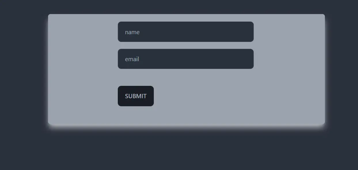
As we can see we are rendering the form from a reusable card component and we are rendering the button from a reusable button component as well.