In this article we will learn about adding an error modal component and how to manage error via the modal. Below are the topic that we will be covering,
- Adding error modal component
- managing errors
Adding error modal component
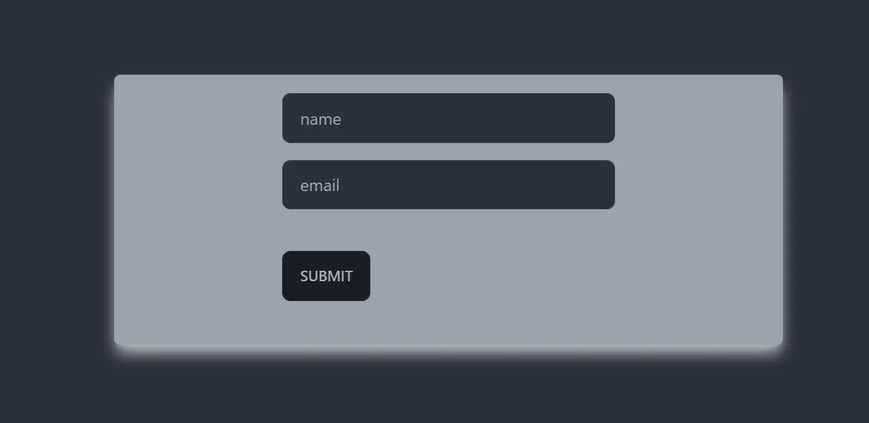
- Create components to add user and manage the user lists,
In app.js
import React, { useState } from "react";
import AddUser from "./AddUser";
import './App.css'
import UserLists from "./components/UserLists";
const App = () => {
  // state for user list
  const [usersList, setUsersList] = useState([]);

  // function for adding a user data to existing user list
  const addUserHandler = (uName, uEmail) => {
    setUsersList((prevData) => {
      return [...prevData, { name: uName, email: uEmail }]
    })
  };
  return (
    <div>
      <AddUser addUserHandler={addUserHandler} />
      <UserLists usersList={usersList} />
    </div>
  );
}

export default App
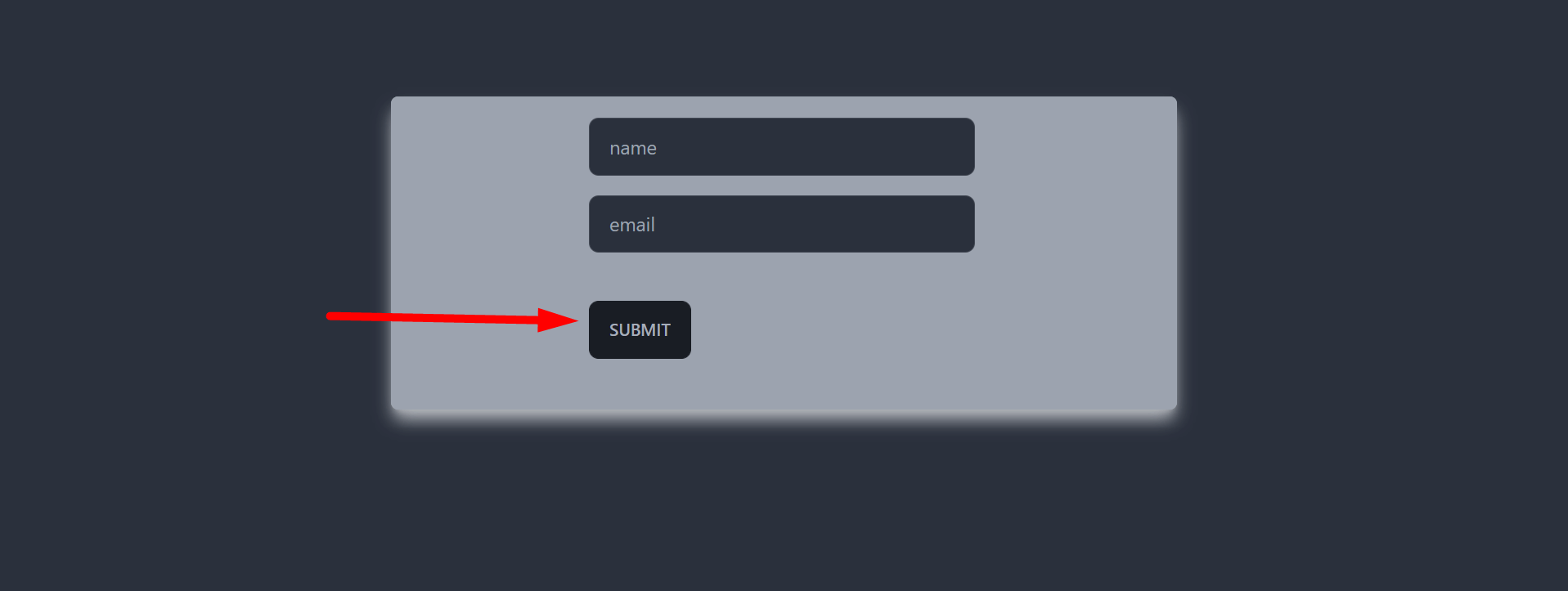
In AddUser component,
import React, { useState } from 'react';
import Button from './Button';
import Card from './Card';

const AddUser = ({ addUserHandler }) => {
    const [userName, setUserName] = useState('');
    const [userEmail, setUserEmail] = useState('');
    const handleFormSubmission = e => {
        e.preventDefault();
        if (!userName || !userEmail) {
            return;
        };
        setUserEmail('');
        setUserName('');
        addUserHandler(userName, userEmail);
    }
    return (
        <div>
            <Card className="bg-gray-400 mx-auto my-24 rounded-md shadow-gray-300 shadow-lg w-1/2">
                <form
                    onSubmit={handleFormSubmission}
                    className='border-2 border-gray-400 shadow-lg rounded-md'>
                    <div className='my-4 block mx-auto w-1/2'>
                        <label htmlFor="name"></label>
                        <input
                            value={userName}
                            onChange={e => setUserName(e.target.value)}
                            className='input input-bordered w-full max-w-xs'
                            id='name' name="name"
                            type="text"
                            placeholder='name'
                        />
                    </div>
                    <div className='my-4 block mx-auto w-1/2'>
                        <label htmlFor="email"></label>
                        <input
                            value={userEmail}
                            onChange={e => setUserEmail(e.target.value)}
                            className='input input-bordered w-full max-w-xs'
                            id='email'
                            name="email"
                            type="email"
                            placeholder='email'
                        />
                    </div>

                    <div className=' my-10 block mx-auto w-1/2'>
                        <Button className='btn' type="submit">Submit</Button>
                    </div>
                </form>
            </Card>
        </div>
    );
};

export default AddUser;
In UserLists component,
import React from 'react';
const UserLists = ({ usersList }) => {
    return (
        <div className="bg-gray-400 mx-auto my-24 rounded-md shadow-gray-300 shadow-lg w-1/2">
            <ul className='text-black underline'>
                {usersList.map(user => (
                    <>
                        <li>{user.name}</li>
                        <li>{user.email}</li>
                    </>
                ))}
            </ul>
        </div>
    );
};

export default UserLists;
The Card.js component,
import React from 'react';

const Card = (props) => {
    return (
        <div className={props.className}>
            {props.children ? props.children : undefined}
        </div>
    );
};

export default Card;
And the Button.js component,
import React from 'react';

const Button = (props) => {
    return (
        <button className={props.className} type={props.type || 'button'} >{props.children}</button>
    );
};

export default Button;
Note: Please read these articles to know more about taking user data and managing the user state.
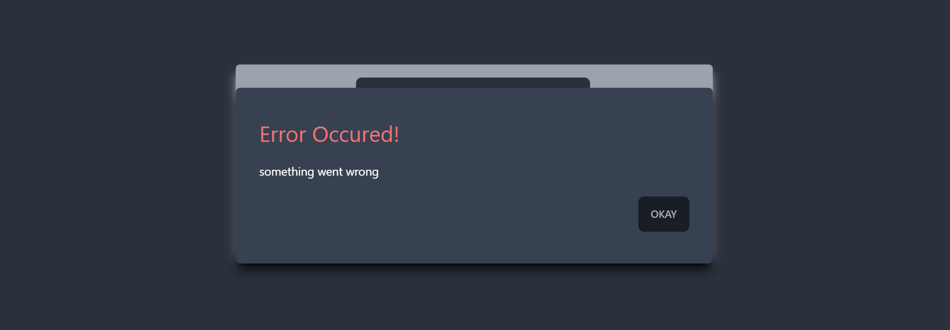
- Create a component named, ErrorModal.js
import React from 'react';

const ErrorModal = () => {
    return (
        <div>

        </div>
    );
};

export default ErrorModal;
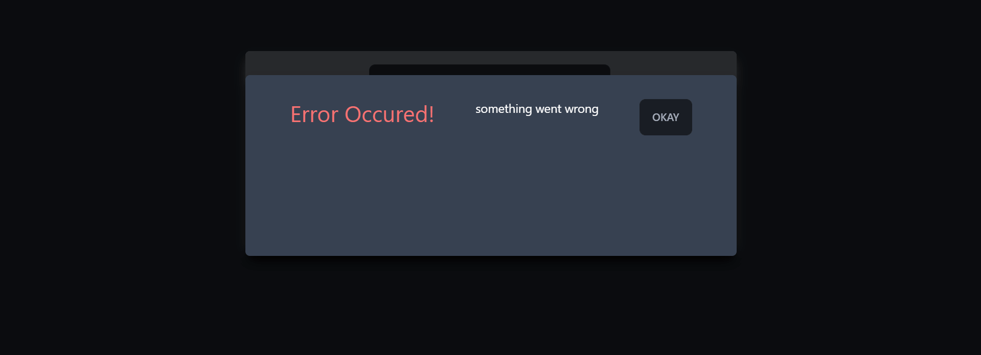
- Add some HTML elements like div, header, footer, etc. to create it properly.
import React from 'react';
import Button from './Button';

const ErrorModal = (props) => {
    return (
        <div className='fixed h-60 top-32 left-[25%] w-2/4 z-50 overflow-hidden  flex column justify-around bg-gray-700 p-8 rounded-md shadow-lg shadow-black'>
            <header>
                <h2 className='text-3xl text-error'>Error Occured!</h2>
            </header>
            <div>
                <p className='text-white'>something went wrong</p>
            </div>
            <footer className='flex justify-end
            '>
                <Button className='btn'>Okay</Button>
            </footer>
        </div>
    );
};

export default ErrorModal;
Here we have added some HTML elements alongside some Tailwind CSS styles. Please read this article to know more about it.
- Import this ErrorModal component in the AddUser component.
import React, { useState } from 'react';
import Button from './Button';
import Card from './Card';
import ErrorModal from './ErrorModal';

const AddUser = ({ addUserHandler }) => {
    const [userName, setUserName] = useState('');
    const [userEmail, setUserEmail] = useState('');
    const handleFormSubmission = e => {
        e.preventDefault();
        if (!userName || !userEmail) {
            return;
        };
        setUserEmail('');
        setUserName('');
        addUserHandler(userName, userEmail);
    }
    return (
        <div>
            <ErrorModal />
            <Card className="bg-gray-400 mx-auto my-24 rounded-md shadow-gray-300 shadow-lg w-1/2">
                <form
                    onSubmit={handleFormSubmission}
                    className='border-2 border-gray-400 shadow-lg rounded-md'>
                    <div className='my-4 block mx-auto w-1/2'>
                        <label htmlFor="name"></label>
                        <input
                            value={userName}
                            onChange={e => setUserName(e.target.value)}
                            className='input input-bordered w-full max-w-xs'
                            id='name' name="name"
                            type="text"
                            placeholder='name'
                        />
                    </div>
                    <div className='my-4 block mx-auto w-1/2'>
                        <label htmlFor="email"></label>
                        <input
                            value={userEmail}
                            onChange={e => setUserEmail(e.target.value)}
                            className='input input-bordered w-full max-w-xs'
                            id='email'
                            name="email"
                            type="email"
                            placeholder='email'
                        />
                    </div>

                    <div className=' my-10 block mx-auto w-1/2'>
                        <Button className='btn' type="submit">Submit</Button>
                    </div>
                </form>
            </Card>
        </div>
    );
};

export default AddUser;
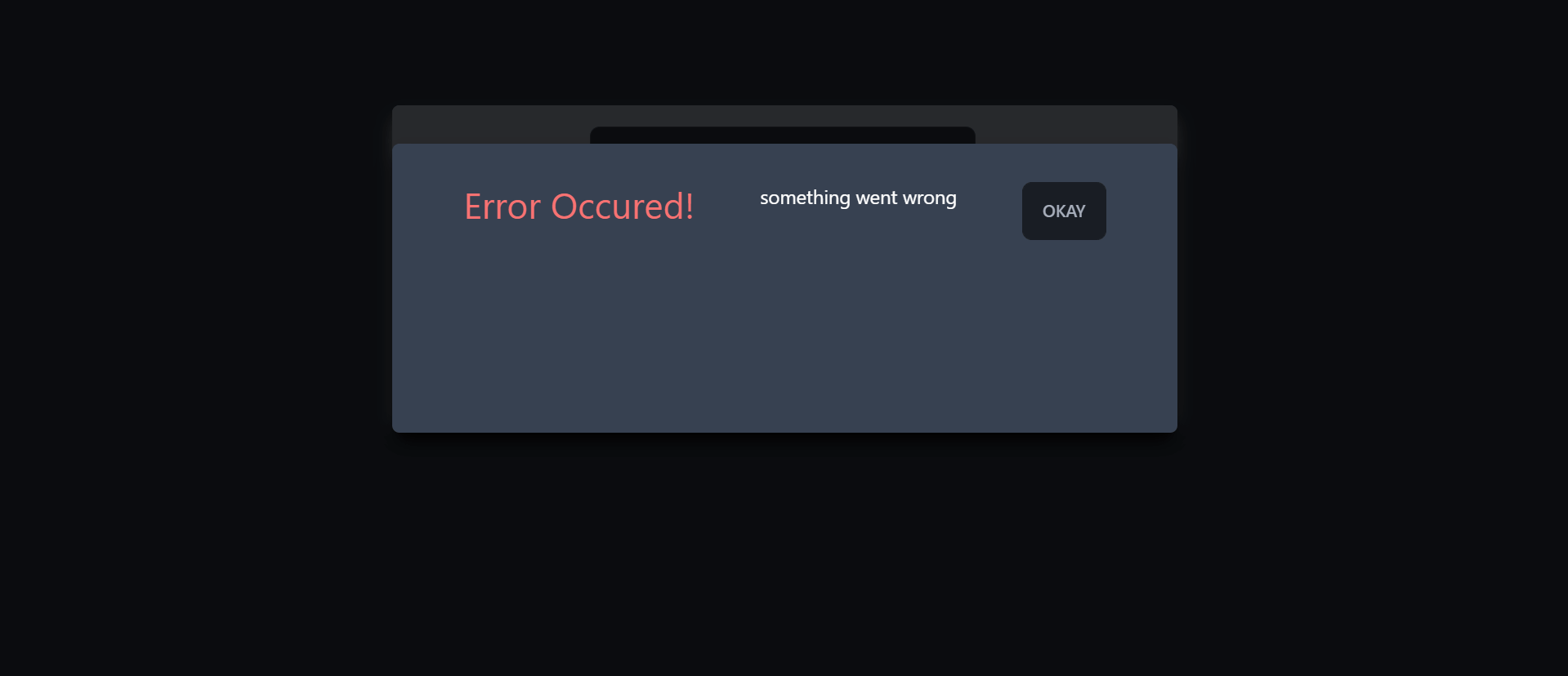
- Add some backdrop to the modal so that it looks a bit better.
<div className='fixed top-0 left-0 w-full z-10 h-screen bg-[rgba(0,0,0,0.75)]' />
import React from 'react';
import Button from './Button';

const ErrorModal = (props) => {
    return (
        <>
            <div className='fixed top-0 left-0 w-full z-10 h-screen bg-[rgba(0,0,0,0.75)]' />
            <div className='fixed h-60 top-32 left-[25%] w-2/4 z-50 overflow-hidden  flex column justify-around bg-gray-700 p-8 rounded-md shadow-lg shadow-black'>
                <header>
                    <h2 className='text-3xl text-error'>Error Occured!</h2>
                </header>
                <div>
                    <p className='text-white'>something went wrong</p>
                </div>
                <footer className='flex justify-end
            '>
                    <Button className='btn'>Okay</Button>
                </footer>
            </div>
        </>
    );
};

export default ErrorModal;
Managing errors
- Declare a state variable with empty default value in the AddUser component so that by default the result can be undefined (you can add the default result as undefined as well. Either way, it is fine.)
    // errors
    const [errors, setErrors] = useState(undefined);
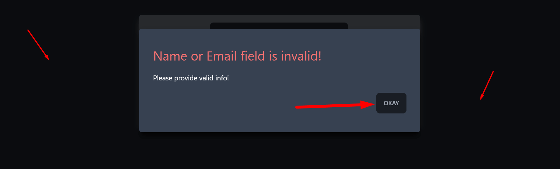
- Set the error messages or contents inside of the handleFormSubmission function in AddUser component.
if (!userName || !userEmail) {
           setErrors({
               title: 'Name or Email field is invalid',
               message: "Please provide valid info!"
           })
           return;
       };
import React, { useState } from 'react';
import Button from './Button';
import Card from './Card';
import ErrorModal from './ErrorModal';

const AddUser = ({ addUserHandler }) => {
    const [userName, setUserName] = useState('');
    const [userEmail, setUserEmail] = useState('');
    // errors
    const [errors, setErrors] = useState(undefined);
    const handleFormSubmission = e => {
        e.preventDefault();
        if (!userName || !userEmail) {
            setErrors({
                title: 'Name or Email field is invalid',
                message: "Please provide valid info!"
            })
            return;
        };
        setUserEmail('');
        setUserName('');
        addUserHandler(userName, userEmail);
    };


    return (
        <div>
            <ErrorModal />
            <Card className="bg-gray-400 mx-auto my-24 rounded-md shadow-gray-300 shadow-lg w-1/2">
                <form
                    onSubmit={handleFormSubmission}
                    className='border-2 border-gray-400 shadow-lg rounded-md'>
                    <div className='my-4 block mx-auto w-1/2'>
                        <label htmlFor="name"></label>
                        <input
                            value={userName}
                            onChange={e => setUserName(e.target.value)}
                            className='input input-bordered w-full max-w-xs'
                            id='name' name="name"
                            type="text"
                            placeholder='name'
                        />
                    </div>
                    <div className='my-4 block mx-auto w-1/2'>
                        <label htmlFor="email"></label>
                        <input
                            value={userEmail}
                            onChange={e => setUserEmail(e.target.value)}
                            className='input input-bordered w-full max-w-xs'
                            id='email'
                            name="email"
                            type="email"
                            placeholder='email'
                        />
                    </div>

                    <div className=' my-10 block mx-auto w-1/2'>
                        <Button className='btn' type="submit">Submit</Button>
                    </div>
                </form>
            </Card>
        </div>
    );
};

export default AddUser;
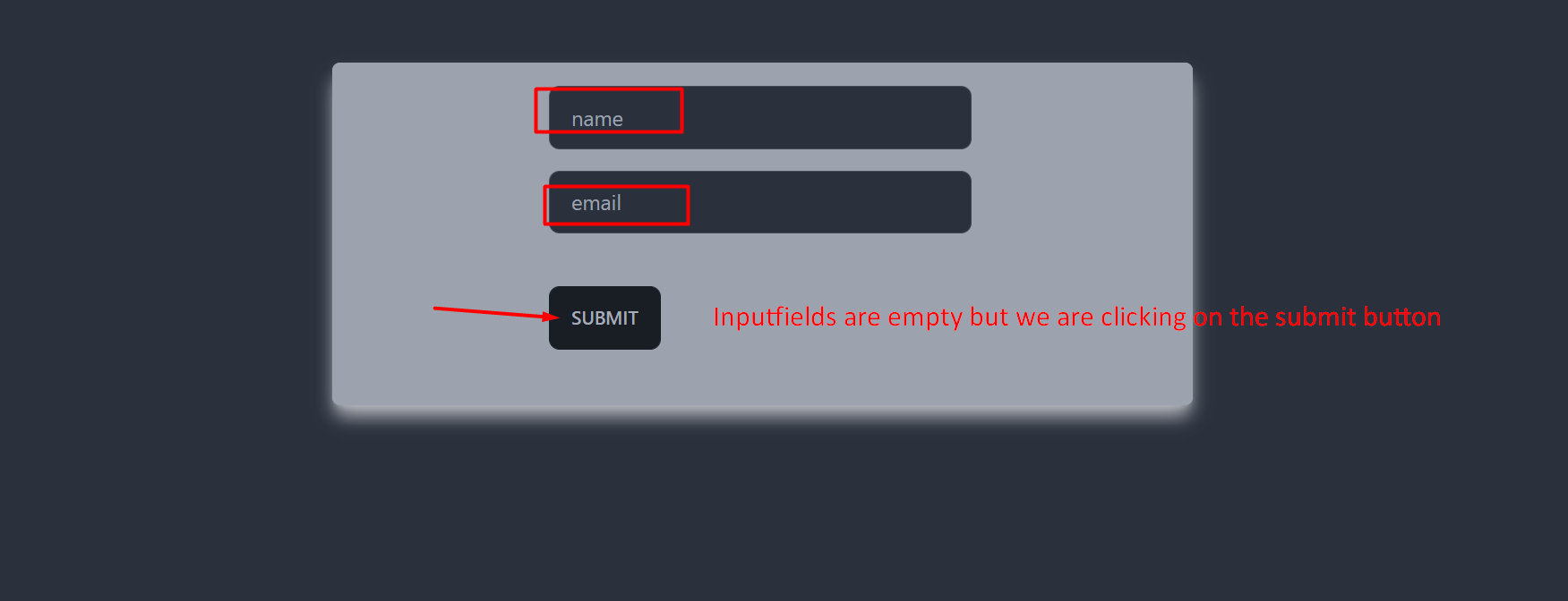
- Write && condition with the errors and the ErrorModal. The things is, we want to render this modal, if the input values are empty (or any error occurred that we are setting).
{errors && <ErrorModal />}
import React, { useState } from 'react';
import Button from './Button';
import Card from './Card';
import ErrorModal from './ErrorModal';

const AddUser = ({ addUserHandler }) => {
    const [userName, setUserName] = useState('');
    const [userEmail, setUserEmail] = useState('');
    // errors
    const [errors, setErrors] = useState(undefined);
    const handleFormSubmission = e => {
        e.preventDefault();
        if (!userName || !userEmail) {
            setErrors({
                title: 'Name or Email field is invalid',
                message: "Please provide valid info!"
            })
            return;
        };
        setUserEmail('');
        setUserName('');
        addUserHandler(userName, userEmail);
    };


    return (
        <div>
            {errors && <ErrorModal />}
            <Card className="bg-gray-400 mx-auto my-24 rounded-md shadow-gray-300 shadow-lg w-1/2">
                <form
                    onSubmit={handleFormSubmission}
                    className='border-2 border-gray-400 shadow-lg rounded-md'>
                    <div className='my-4 block mx-auto w-1/2'>
                        <label htmlFor="name"></label>
                        <input
                            value={userName}
                            onChange={e => setUserName(e.target.value)}
                            className='input input-bordered w-full max-w-xs'
                            id='name' name="name"
                            type="text"
                            placeholder='name'
                        />
                    </div>
                    <div className='my-4 block mx-auto w-1/2'>
                        <label htmlFor="email"></label>
                        <input
                            value={userEmail}
                            onChange={e => setUserEmail(e.target.value)}
                            className='input input-bordered w-full max-w-xs'
                            id='email'
                            name="email"
                            type="email"
                            placeholder='email'
                        />
                    </div>

                    <div className=' my-10 block mx-auto w-1/2'>
                        <Button className='btn' type="submit">Submit</Button>
                    </div>
                </form>
            </Card>
        </div>
    );
};

export default AddUser;
- Send the setErors function to the ErrorModal component so that the modal can be removed by either clicking on the backdrop or in the okay button.
{errors && <ErrorModal setErrors={setErrors}/>}
- Receive this function in the ErrorModal component and set the state of this variable as undefined by triggering an onClick() event.
import React from 'react';
import Button from './Button';

const ErrorModal = ({ setErrors }) => {
    return (
        <>
            <div className='fixed top-0 left-0 w-full z-10 h-screen bg-[rgba(0,0,0,0.75)]' onClick={() => setErrors(undefined)} />

            <div className='fixed h-60 top-32 left-[25%] w-2/4 z-50 overflow-hidden  flex flex-col justify-around bg-gray-700 p-8 rounded-md shadow-lg shadow-black'>
                <header>
                    <h2 className='text-3xl text-error'>Error Occured!</h2>
                </header>
                <div>
                    <p className='text-white'>something went wrong</p>
                </div>
                <footer className='flex justify-end'>
                    <Button onClick={() => setErrors(undefined)} className='btn'>Okay</Button>
                </footer>
            </div>
        </>
    );
};

export default ErrorModal;
- Go to the Button component and use the onClick function there as well.
import React from 'react';

const Button = (props) => {
    return (
        <button onClick={props.onClick} className={props.className} type={props.type || 'button'} >{props.children}</button>
    );
};

export default Button;
Whenever we click on the backdrop or the submit button, the state for the errors will be set as undefined. Hence the modal will disappear.
- Set dynamic values of the errors in the ErrorModal component.
{errors && <ErrorModal errors={errors} setErrors={setErrors} />}
We are passing the data that the errors state holds to the component,
import React from 'react';
import Button from './Button';

const ErrorModal = ({ setErrors, errors }) => {
    return (
        <>
            <div className='fixed top-0 left-0 w-full z-10 h-screen bg-[rgba(0,0,0,0.75)]' onClick={() => setErrors(undefined)} />

            <div className='fixed h-60 top-32 left-[25%] w-2/4 z-50 overflow-hidden  flex flex-col justify-around bg-gray-700 p-8 rounded-md shadow-lg shadow-black'>
                <header>
                    <h2 className='text-3xl text-error'>{errors.title}!</h2>
                </header>
                <div>
                    <p className='text-white'>{errors.message}</p>
                </div>
                <footer className='flex justify-end'>
                    <Button onClick={() => setErrors(undefined)} className='btn'>Okay</Button>
                </footer>
            </div>
        </>
    );
};

export default ErrorModal;
Here, we are receiving the errors data as props, and using them dynamically inside the HTML elements.
So whenever we click on the submit button of the form without inputting any values in the input fields, this modal will pop up, and if we click on the backdrop or submit button, this will be dismissed.
This is how we can manage errors and show them with a modal.